Favourites from the drawing-a-day project
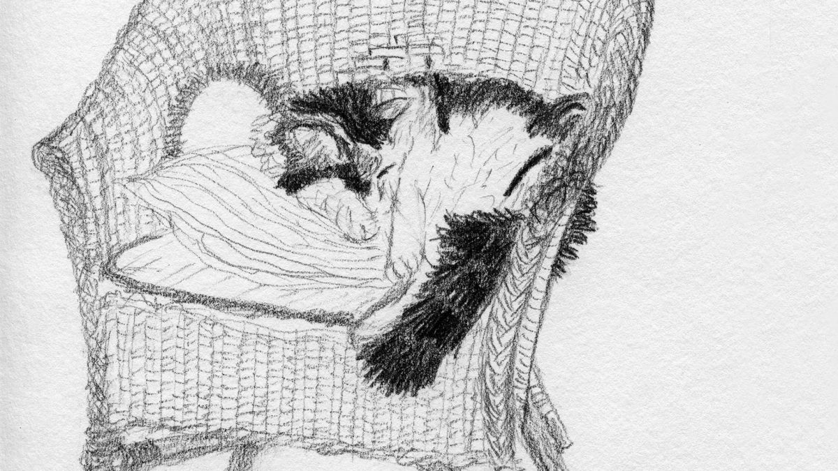
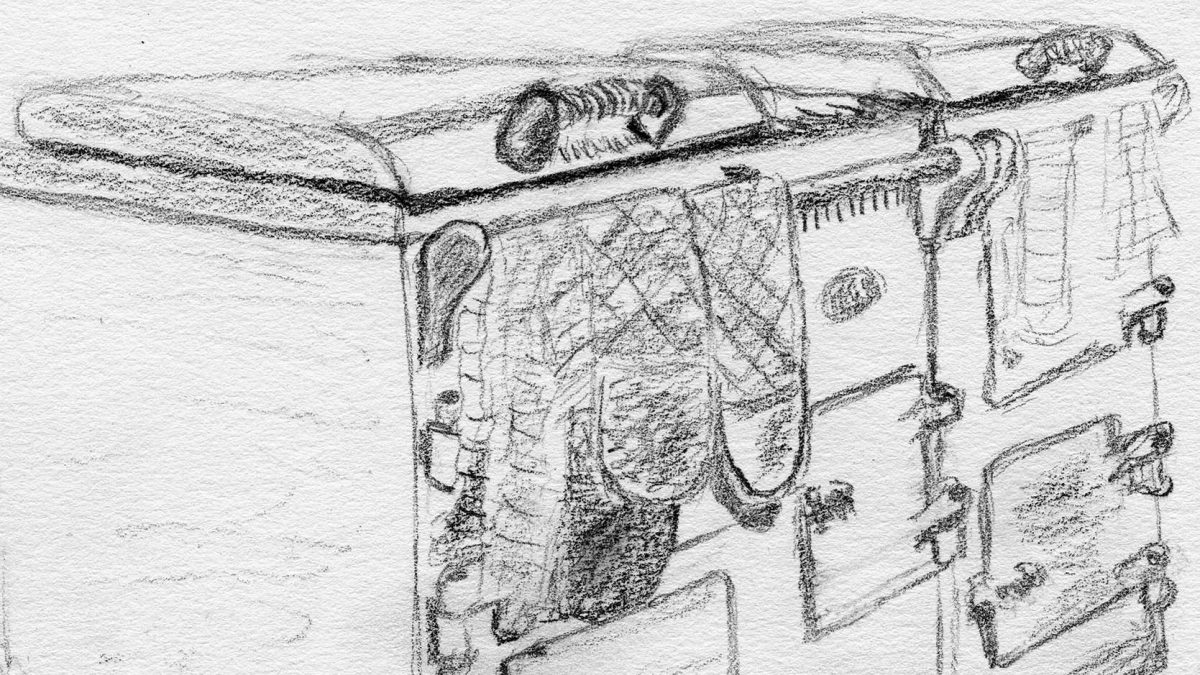
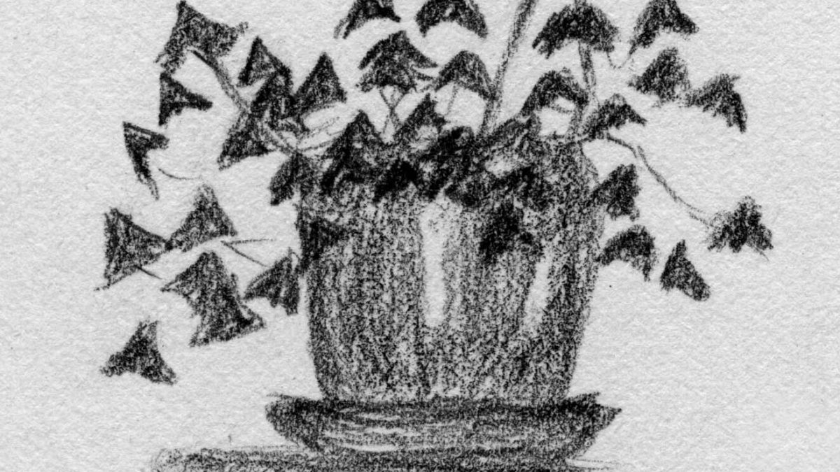
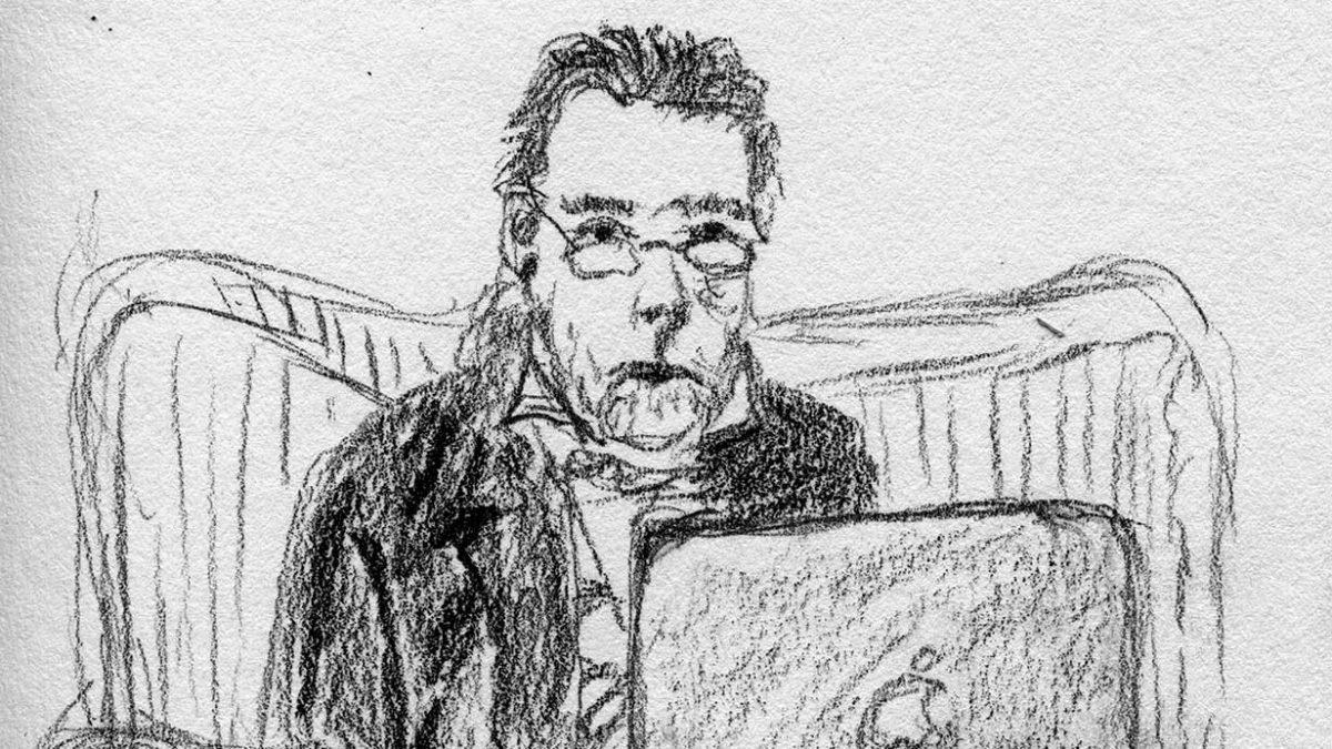
I don’t draw enough, so I made a resolution to do one a day this year. I’m curious to see how the drawings change with practice. Here are the first five. I’ve put them on Instagram as well. Not sure whether I’ll publish the whole lot: scanning and uploading seems to be more fuss than just doing the drawings.


 [Some jottings from my notebook]
 Lots of site-specific work (it’s a meme! —first saw it with that American guy a few shows ago—v powerful piece about slavery etc with the weird black Murano glass chandeliers). Examples this year: Giardini; the Venetian blinds in the Korean pavilion; giveaway postcards of Marghera in the Corderia.
Stuffed cats so far: German, Russian.
Stuffed dogs: Nordic; USA (several, but not, I think, real ones).
Several works obviously feminine in style (use of textiles, domestic interiors). Amused to find that we were nearly always guessing the gender of the artist correctly (yes, discovered later that the Korean one was a woman, too).
Scandinavian gay dead writer most impressive so far, but it was a pity they had to include an explanation. Other half of that show (the Danish/Nordic pavilion) is v good too (and feminine, by way of contrast, and also bleak).
Russian pavilion is a ghost train! The automatic artist drawing circles is genuinely creepy. French one is a black prison with black flags inside. Lots of bleak stuff about—recession?
Spanish paintings a bit like our own Gail de Cordova. Nice chairs in there too (with bark on!).
Jef Geys (Belgium)—nice counterpoint to the Simon Baron-Cohen autism/Aspergers book (which I was reading at the time). Collection/classification is a pervasive theme (influence of Damien Hirst).
Yoko Ono quote found in the bookshop: the glass is not half empty. It is 100% full, half with water and half with air. Yes!
In between the good stuff there is a lot of sixth-form (puerile) art. Too much text. Using text in visual art is hard (see Keith Tyson or Tracey Emin for successful use). A beginners’ book on drawing and painting that I read years ago recommended always rendering text illegible if it occurs in the scene, otherwise it draws the eye and distorts the viewer’s response to the composition. Like all rules, this is to be broken, but only by those who know what they’re doing.
More to follow, and photos of the art, when I get round to it. See Biennale website meanwhile.
Silence here has gone on longer than I expected. Curiously, a long silence is harder to break than a short one (I find this in personal correspondence, too). It seems as though you have to write something important, not just the usual trivia.
So, a few days ago when out for a walk in the sun at midday (trying hard not to be SAD this year) I was very pleased when a really good idea for a profound and fascinating posting popped into my head. And of course the predicable then happened.
I can still remember what was going to be the second half of it, which was (I do distinctly recall) the less interesting bit. This was about Malcolm Gladwell’s recent idea that it takes 10,000 hours of practice to attain world-class competence at anything. The question that occurs first in reaction to this is: why only 10,000 hours and not even more? The answer seems to be: because nobody ever has more than 10,000 hours to spend. So in fact, if you turn his statement around, you get the answer to a more interesting question, which is: how do we decide what world-class competence is, or what it should be? And it seems that our definition of world-class competence is: “That degree of competence that can be attained by the most able individual after spending as much time practising as anyone can ever find the time for”.
The corollary is that our concept of world-class competence is not an absolute – if the world changes in such a way (for example by the invention of new technology) that an able individual can attain a higher degree of skill in less than 10,000 hours, then we will cease to value competence at the level that we previously judged to be world-class.
Ah, now I remember what the first half was about! There’s nothing like starting to write for unblocking the memory, after all. It was about realistic visual art and its relationship with graphic-arts technology.
Think about Vermeer. He put in his 10,000 hours, for sure. Achieving the effects that he achieved in paint on canvas is slow. But what would a modern-day Vermeer be doing now? I’m certain that he’d start with a camera in his hand, and use Photoshop and a graphics tablet. And that means that he’d be able to produce his results so much quicker. Anybody with a reasonably good eye for composition and colour, and a taste for arranging objects and lighting, can get halfway to producing something like a Vermeer these days by using those tools. The competence that he worked so hard to attain is now pretty easy to come by. Perhaps he could have got it in 1,000 hours of practice. What would he have done in the following 9,000 hours? What would our understanding of the possibilities of art now be?
I will go hundreds of miles just to look at an original Vermeer. I don’t quite know why, when I can look at a reproduction any time. This is another piece of the puzzle, though.
One of our neighbours is Michael Gillespie, the sculptor. We went to his open studio recently, and Andrew asked him to what extent he plans in advance the way his abstract sculptures will develop. He replied that it’s like speech: do you plan exactly what you’re going to say before you start talking?
A while ago I was talking with Alan about what it’s like to do your job in a foreign language (he uses German every day and even chairs meetings in it). He said that he thinks German-speakers plan their speeches more carefully than we do. Before you launch into one of those long sentences with the verb at the end you have to know where you’re going!
Maybe it’s the same with sculpture: perhaps you would plan it more, or less, depending on the medium you were using. As with spoken languages, some materials might lend themselves to spontaneity while others would reward a more premeditated approach.
Something that strikes me as odd in Amsterdam is the existence, side by side, of two radically different ways of being (or looking) female. Two styles. The Red Light District style—the naked body, make-up, red fabric, black leather etc—and the scrubbed face, denim, bike-riding, no-nonsense types. We speculate that there is even a cross-over between the two. Are there young women who arrive by bike wearing their jeans, undress, put on the make-up and stand in the window? This whole juxtaposition seems to us Dutch and not English. We are similar but not, after all, the same. [See also ‘Dutch Girl’ by Lisa Yuskavage, recently acquired by the Stedelijk Museum. Nice modern take on Vermeer!]
Another clue to the difference in cultures might be the lack of attention to safety precautions on the city’s many building sites. Andrew has noticed builders on scaffolding without hats, and items being lifted and lowered with no safety barriers, while pedestrians walk beneath—not just on one site, but generally. Is this (I speculate) another facet of the same basic attitude that gives rise to the existence of the coffee shops and the prostitution?
If I were younger I would start asking at this point “and is it a good or a bad thing?” But these days I don’t think in those terms nearly so much. It’s an interesting thing, that’s all. It gives rise to some consequences that are probably good, and some others that are undesirable. On balance, would I choose to live with it or not? I’m not sure. My answer might depend on how lucky I was feeling when you asked me. My optimistic self would find it refreshing. My pessimistic self might be scared.
This happened 12 years ago but it’s still vivid in my mind. I hope it always will be.
It was the year Andrew and I got engaged (we were married in 1997). We got tickets for the great Vermeer show in the Mauritshuis at The Hague. We were not the only ones looking forward to it as the best art show of the decade.
When we got there, clutching our timed tickets (for 6pm, if memory serves—purchased from the Dutch consulate in London) the museum was closing and the last visitors were being ushered out. We argued. An official was fetched. Our tickets were examined. An executive decision was taken.
For the next hour, accompanied by a bored security guard, we had exclusive access to the Vermeers. We wandered, we peered, we savoured. We ran from one to another exclaiming and comparing. Look! He’s used the same props in this one. And again—the yellow dress—look!
They aren’t very big, Vermeers. They are exquisite. They had never all been together in the same place before, and probably they never will be again. The next day, back among the crowds for a second look, joining the scrum around every painting, we realised the full value of the luck we’d had. It was amazing.
Monet is better! Really Renoir should have done figures all along. (They show two early works of theirs side by side and it’s obvious.) But some of Renoir’s work is very good – especially later ones with less distracting stuff in them, just lots of vegetation.
Sometimes it looks as though he has turned up the Shadows/Highlights filter in Photoshop too high – shadow areas aren’t deep enough and they’re too blue.
[ We actually went to this exhibition a week ago last Saturday, but I haven’t fully got into the blogging habit yet so it only just occurred to me that it’s the kind of thing I could post. This is transcribed from my notebook entry at the time. ]